
Saving Supper
UX/UI Case Study
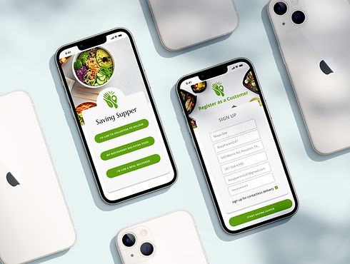
Saving Supper is a mobile application that connects a volunteer network with fast casual dining restaurants to deliver prepared meals that would have been otherwise wasted to food insecure families that same day.

Problem
Food Waste
-
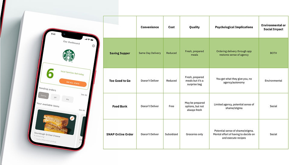
According to Feeding America, in the United States one pound of food per person per day is wasted. In a year, that equates to 130 billion meals and more than $408 billion in food thrown away.
Food Insecurity
-
1 in 8 Americans received SNAP benefits in 2021...but there are limitations:
-
Tedious application process, not all who are food insecure qualify
-
Still requires time and effort to shop and cook–no delivery option!
-
Only 7/50 states offer the Restaurant Meals Program
-
Solution
A mobile application that allows food insecure families to place orders for delivery. Fast casual restaurants with excess inventory sign up to donate these meals, while volunteers deliver the meals to those in need.
Users
-
People in need of reduced cost meal delivery.
-
Fast casual restaurants with excess inventory and a desire to support local families.
-
Volunteers who are willing to pickup prepared meals from restaurants and deliver them to customers.
My Role
Worked with three person team throughout the entire process, including the overall strategy, user research, information architecture, user testing, interaction design, and visual design.
The Design Process
The User Center Design is an iterative process due to the research and continual feedback that is uncovered along the way. It is important to set a strong foundation in the early phases which acts as a point of focus in later phases.
Inspiration
The inspiration phase is where the team observed and uncovered details involving processes, personal lives, behaviors, and pain points of the intended users for the app. The information uncovered in this phase has been critical and a driving force behind the design decisions in the following phases.
Competitive Analysis
User Interviews
Objectives:
-
Restaurant: Understand how fast casual restaurants manage food waste.
-
Volunteer: Understand the pain points and motivating factors that inhibit or enhance a volunteer's experience.
-
Customer: Understand the customer's relationship with meal delivery service
Methods:
-
Expert Interview with Fast Casual Restaurant Representative
-
Expert Interview with Associate from Chocco
-
Survey of Peers on Meal Delivery Use
Customer Persona
Themes
-
The key drivers for using meal delivery apps are convenience, and speed.
-
Food Delivery Apps have truly reached critical mass. It is no longer only relegated to a specialized segment of consumers.
-
Reliability and assurance that the meal will arrive on time.
Restaurant Persona
Themes
-
The main goal of most restaurants is to execute their orders as efficiently and cheaply as possible. Added logistics, expenses, and technology is undesirable, unless it is a short-term investment for a long-term gain.
-
Generally in the scheme of all food waste in a given year, restaurants won't care about a few extra leftovers each day, even if they make some extra money from it. The decision has to be top-down, it has to fit into existing workflows, it has to contribute to a broader PR strategy.
Volunteer Persona
Themes
-
Volunteering itself may not be fun, so adding a social element can enhance the appeal
-
Being clear about time requirements can help volunteers determine if their schedules allow for the activity
-
Incorporating some sort of gamification can promote prolonged, consistent engagement
Ideation
Once we gathered the observations and understood our intended users, we moved into the next ideation phase. In this phase, a deeper understanding of the users is formed through user personas and user journeys, which help drive the app's information architecture. In this phase, the team worked to solve our target audience's pain points and desires.
User Personas


User Flow

Iteration
High Fidelity Prototype


Rapid Prototype

Low - Med Fidelity Prototype

Usability Test
Throughout the development, we received essential feedback from our user journey, personas, and prototypes. The feedback pointed out key concerns that helped the team organize and structure the user flow diagram for each user.
The initial registration page received positive feedback and suggestions for improvements. We were able to take the comments and work through a user path that would address both sets of observations. Ultimately, this helped us make a user flow for registration that is effortless and concise.
Positive
"Your app seems to be thoughtful and considerate to a variety of people in need. "
"Cool idea to convert them into becoming a volunteer."
"Aesthetically pleasing and consistent"
"Personas (Volunteer, User, Restaurant) are logical representations of the product. Well thought out and defined personas"
Constructive
"I wonder if there could be some expectation setting right in the registration phase. Perhaps a simple way to know what they will be seeing and what are the benefits they will be enjoying pretty soon if they stick with it."
"I see that being anonymous is potentially very important to the user. So right in the registration phase, it could be helpful to include an option to opt-in or out to leaving a bag without doorbell ring, etc. something like that, maybe there should also be a selection of any food preferences or allergies at this stage as well."
Ideation
Brand Persona
Overview of Brand Personality:
Sam is a new friend you instantly gravitated toward because of their pleasant and friendly demeanor. You quickly realize Sam is someone you can immediately trust and has an honest outlook on life. Sam is a friend to everyone and genuinely has nothing but good intentions. Sam knows how to sprinkle humor into a conversation to quickly form a friendship.
Voice:
The voice of Saving Supper is friendly and casual, with light humor subtly sprinkled throughout the app. Saving Supper is a new friend where the conversation is light and polite but comfortable and familiar. The voice of Saving Supper keeps it short and sweet while keeping focus on the user.
In critical situations such as a technical error or when a favorite meal is unavailable, Saving Supper is apologetic and eager to correct the problem.
Color:
The bright and complimentary color palette of Saving Supper conveys a friendly confidence. The use of light gray and white space balances the bright colors to tie in the approachable, reliable side of Saving Supper.
Typography:
Saving Supper's font is a friendly seif and a modern sans-serif is used for headers and body copy. The typography is simple and easy to read while effectively communicating hierarchy based on weight and scale.
General Style Notes:
Saving Supper embraces white space, ensuring all elements have plenty of breathing room. Interface elements are simple but may utilize realistic, subtle shadowing.

