Minny
UX/UI Case Study
Minny is an app for all types of caregiving circles for streamlined communication on important information, routines, and updates to create consistency and the best overall care for a child.
Northwestern University
Information Design and Strategy
Interface Design
Final Project - 2023

Demo Video
Problem Statement
Often one caregiver is responsible for important information required for a child's well-being. This can become exhausting for the caregiver and overwhelming when they leave the child in someone else's care. Toddlers respond well to consistency in their care, and routine changes can cause stress and outbursts. Minny is looking to streamline communication and enhance consistency within caregiving circles on the ever-changing habits, specific preferences, and big milestones for our very busy toddlers.
Differentiators
Minny will focus on the ever-changing details and preferences of toddlers. Caregivers of toddlers know that important information is constantly changing as they quickly grow and develop. This app will also be inclusive of all caregiving dynamics and support all members of a caregiving circle.
Target Audience
Toddler caregiving circles of all shapes and sizes.
Competitive Analysis
A competitive analysis was conducted to understand the current market offerings better. There are no known direct primary competitors. Therefore research was conducted on three secondary competitors. The main takeaways are that the products are geared towards traditional family dynamics and did not consider the child’s entire caregiving circle, additionally the products were not explicitly designed for caregiving circles of toddlers.
Rapid Prototype
The first round in the design phase rapid prototypes were created. The goal was to focus on user journeys rather than design aesthetics. This pointed out parts of the user journey that may be confusing and helped get on the path of a more intuitive design.


Mid Fidelity Prototype


Usability Testing
The purpose of the usability test is to understand the intuitive nature of the navigation and content layout of the app. Additionally, to learned if the naming and information architecture made sense through the participants' chosen tasks.
Methodology
Due to the short time frame to complete the usability test for all participants, a self-guided test was administered. Participants were sent a link with instructions and asked to voice or video record themselves completing the test.
Participants were given a choice as to which task they wanted to complete. The task selection was the following:
1. Update the pediatrician contact information.
2. Add a new lunch meal idea.
3. Change your mantra to “Pop Culture” mode.


Results and Revisions
-
Most participants selected the first task described: "update pediatrician contact information." All participants that selected that task could not immediately identify where this information would be. Half thought it would be in settings, and half thought it would be on the dashboard. However, once they found the correct page, it was easy to update the information.
-
Some participants were confused on the “manta mode.” It did not make sense to them for the app.
-
Participants unfamiliar with prototypes expressed frustrations with limited functionality and capabilities.
-
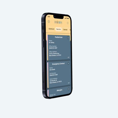
Change the naming of “Info Library” navigation tab to be more reflective of the content and easily understood. Further testing will need to be completed to confirm new name. IDEAS: Care Info, Important Info, Care Center
-
In future usability testing, preface with the limitations of the prototype to curb functionality expectations.
-
Update mantra mode to something more toddler friendly
High Fidelity Prototypes
After multiple iterations and a design system was established, high fidelity prototypes were created. The high-fidelity prototypes reflect the feedback from usability testing
and critiques from every stage.
Minny includes A centrally located place to store important care information like pediatrician contact, current medication list, and doses. An up-to-date routine schedule with details on current preferences, like who’s the favorite bedtime stuffie. A place for meal time ideas, so caregivers know favorite meal items, how to prepare, and which color plate it needs to go on.
Minny ensures consistency in care from all members of your caregiving circle and
allows your toddler to be a toddler.
Next Steps
-
Additional usability testing to test whether the updated navigation headings perform.
-
A/B testing to see if users prefer the manta mode or the updated toddler tips and color options.
-
Post launch user surveys to gain insight on usefulness of content or if there is any content users would like to see.


